
Litmus Dashboard Before & After
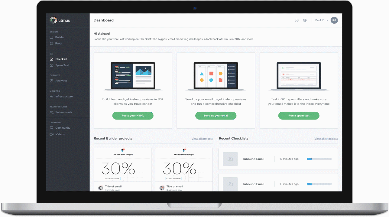
Litmus Dashboard
As my first project with Litmus, I focused on redesigning the home dashboard.
Roles: Product Designer
Tools: Sketch, InVision, Abstract, Adobe After Effects
DESIGN AUDIT
In my design audit, I isolated two primary user pathways to access different features that Litmus provides, access via dashboard and access via side navigation. I found that this number reflected the lack of connection between Litmus’ various features (i.e. a more integrated approach would prompt users more frequently to engage with different features). It appears the user may not understand how Litmus can operate in different stages of their email design process because the user flows are siloed.
A user who created an email on Builder must resend the email to Litmus in the Proof feature, rather than Litmus automatically integrating emails throughout the platform.
A user who created an email on Builder or sent/re-uploaded an email onto Proof must resend or re-upload an email for Checklist.
Proof is accessed as a separate feature with its own UI, but potentially could be an added as an extra feature onto the Builder interface.
I hypothesized that the current structure affects user understanding of the application. If the initial walk-through experience and features on the dashboard integrated the disparate functions of the app, users may better see the wholistic value of the product (thus encouraging customers to engage with more than one feature). Because of this, I decided to dive into the dashboard redesign efforts to help create a more seamless flow between distinct features Litmus offers.
Initial Explorations
Based on my findings from the design audit, I drew around 25 mockups detailing potential new user-interfaces. I decided to isolate the top 14 iterations to present to my UX Design Lead and narrowed it down further for our weekly crit.


Based on my conversations with the product design team, I decided to focus on creating mockups for iterations 7, 8, 10, 11, 12 and 14. Thanks to the Litmus’ organized design system on Abstract, I was able to rapidly prototype a wide variety of iterations to allow the design team to evaluate the different strength and weaknesses of each user interface to help iterate on the conceptual interaction and experience components, as well as stylistic and design choices.


From my discussion with the product design team, we highlighted several strengths and weaknesses from the mockups display above. A couple of the key takeaways are depicted below.
Hide the “Getting Started” grid which displays Litmus’ key features to better allow the user to optimize the space of the dashboard to their campaigns
Focus on the campaign views which tie together the different features of Litmus into one integrated workflow
De-emphasize the use of color to move towards professionalism and minimalism
Explore what campaign creation looks like and how email marketing managers can either customize their team’s workflow
Build upon designs of the dashboard as a project management tool

View the full interactive prototype using this link: https://projects.invisionapp.com/d/main#/console/15738613/326750059/preview