
Clover Redesign
As a Kleiner Perkins Design Challenge Finalist, I elected to redesign Clover, a comprehensive point of sale system which facilitates transactions and hopes to enable businesses to turn transaction data into actionable insights.
Design Challenge: How can Clover’s core mobile products (Clover Go & Clover Dashboard) increase a company’s operational efficiency?
Roles: Product Designer & UX Researcher
Tools: Sketch, LucidChart, Adobe Illustrator & After Effects
Duration: May 2019

Overview
PROJECT OVERVIEW
What is Clover?
Clover is a point of sale (POS) platform which enables businesses to conduct transactions and leverage insights from sales data. Clover offers a diverse array of hardware and software product offerings as demonstrated by the image above. The three primary hardware products are the Clover Station, Clover Mini and Clover Flex which are all equipped with Clover’s POS software. Clover has also launched a more affordable option, Clover Go, which functions on any smartphone. This service can be accessed through the Clover Go or Clover Go Bank of America Merchants applications in the iOS and Android app stores.
Why Clover?
As Director of Data Analytics and Strategy at the largest student-run non-profit corporation in the world, Students of Georgetown Inc., I had to interact with Clover often. Through this experience, I discovered that the company’s switch from Square to Clover in the summer of 2016 led to a lot of operational inefficiencies, alongside mismanagement of inventory and data. This inspired me to explore the ways in which Clover could better serve businesses through improved product design.
Why Clover Go?
While my interaction with Clover has mostly been centered on Clover Station and Clover’s web dashboard, I am excited by the potential of Clover Go to increase accessibility of POS services with an affordable alternative to the Clover hardware products. Furthermore, my academic focus on technology in emerging markets guides my interest in mobile-based financial technologies which have taken off in international contexts where mobile proliferation vastly outpaces web proliferation. As someone passionate about the role of financial technologies in empowering traditionally underserved users, I believe Clover Go can provide a high quality yet affordable service to specifically support small business owners. However, in order to do so, Clover should focus on improving Clover’s mobile experience, which my user research indicates is currently not user-friendly.
FINAL DESIGNS OVERVIEW
Click through my final designs to see how I reimagined Clover’s mobile experience.


Inspiration
THE PROBLEM
Clover’s mobile experience is highly compartmentalized. As shown by the figure on the right, Clover currently offers 4 separate applications (with the products displayed in the app store’s order from left to right). Given the “Clover” application reflects its customer reward program, rather than its core competency serving merchants, users can be easily confused. The Clover Go and Clover Go for Bank of America Merchants are only distinguishable due to differing plans provided by Clover and Bank of America. Lastly, the Clover Dashboard app, providing data analytics and insights, is a completely separate app despite clear intersections with Clover Go. In my redesign of the Clover app, my main focus is elegantly consolidating the experience of Clover Go (Bank of America version) with the Clover Dashboard into one app.


GOALS
When trying to distill Clover’s core functions despite its diverse array of products, I found that the company broadly provide three capabilities to its clients. First, it provides the ability to facilitate transactions. Second, it allows users to manage their inventory. Third, the app allows users to access analytical information about their business. As I articulated in the figure on the left, I believe that these functions are mutually dependent. Thus, by improving the user experience of each individual aforementioned function, I hope to drive improvement in operational efficiency and coordination for Clover’s business clients.
USER RESEARCH
I decided to interview users who each utilize Clover for one of the three goals I identified above. I interviewed a Clover inventory manager (Aaron), a Clover-enabled cashier (Kyle) and a Clover-enabled data analyst (Jenna). Below are the user journeys and feature maps I created to visualize my findings.
User Journey Maps


Empathy to Feature Map

REVISITING THE FOCUS
How can I redesign the Clover Go mobile experience to empower small businesses to facilitate transactions, analyze sales data and manage their inventory on one product?
I hope to a) improve the Clover user experience by addressing the pain points revealed by my research and b) elegantly consolidate the disparate functions of Clover Go and Clover Dashboard onto one mobile platform.
Ideation
Given the complexity of the problem I was facing, I followed a structured ideation process to help me understand and tackle the redesign challenge.
01. Assembling & Auditing Current Clover Go & Clover Dashboard Flows by Goal (Managing, Cashing & Analyzing)
02. Drawing Out Initial Mockups
03. Selecting Promising Sketches & Designing Wireframes to Inspire Final Prototype
CLOVER GO & CLOVER DASHBOARD AUDITS


INITIAL SKETCHES

Full App Breakdown
I first began my exploration by breaking down potential interactions between different core functions. This primarily led to my decision to use a hamburger menu. I reasoned that because the platform’s functions are relatively unique, users may not be comfortable with an iconography-driven bottom navigation. I also explored how different pop-up interactions could help me design systematically. Below are my more detailed explorations of the cashing, analysis and management flows.
Transaction Experience Wireframes

Analytics Experience Wireframes


Inventory Experience Wireframes


LO-FI MOCKUPS


Prototyping
FINAL PROTOTYPES
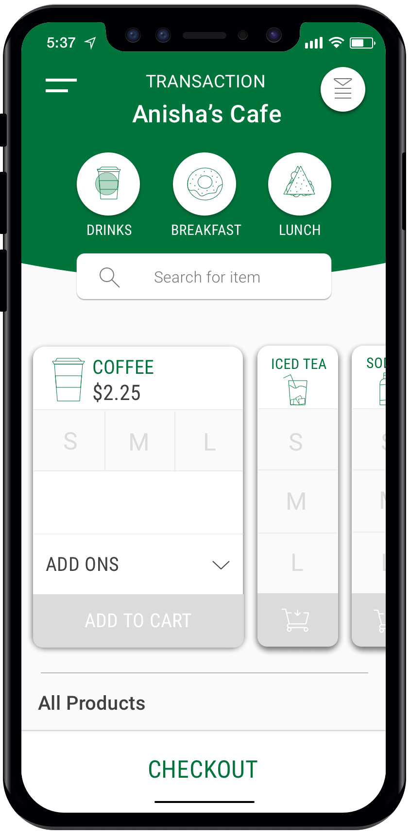
Facilitating Transactions.
Improving the efficiency of cashiers through limited steps required in the checkout process.
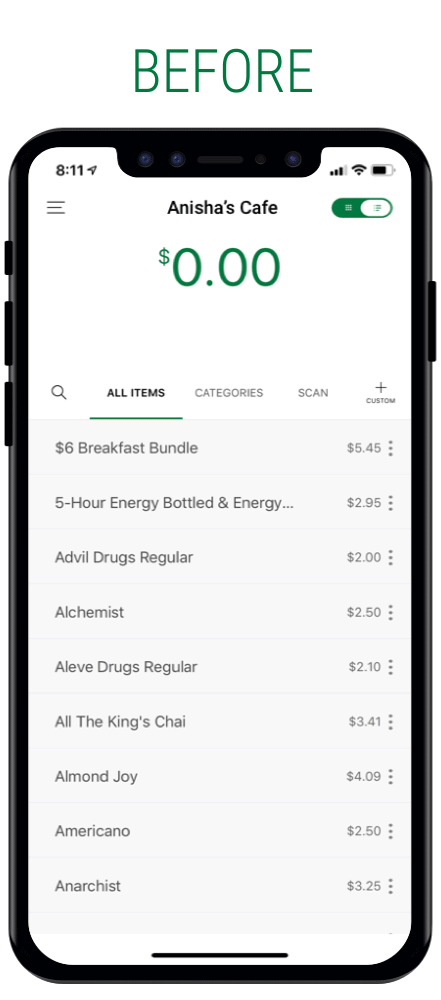
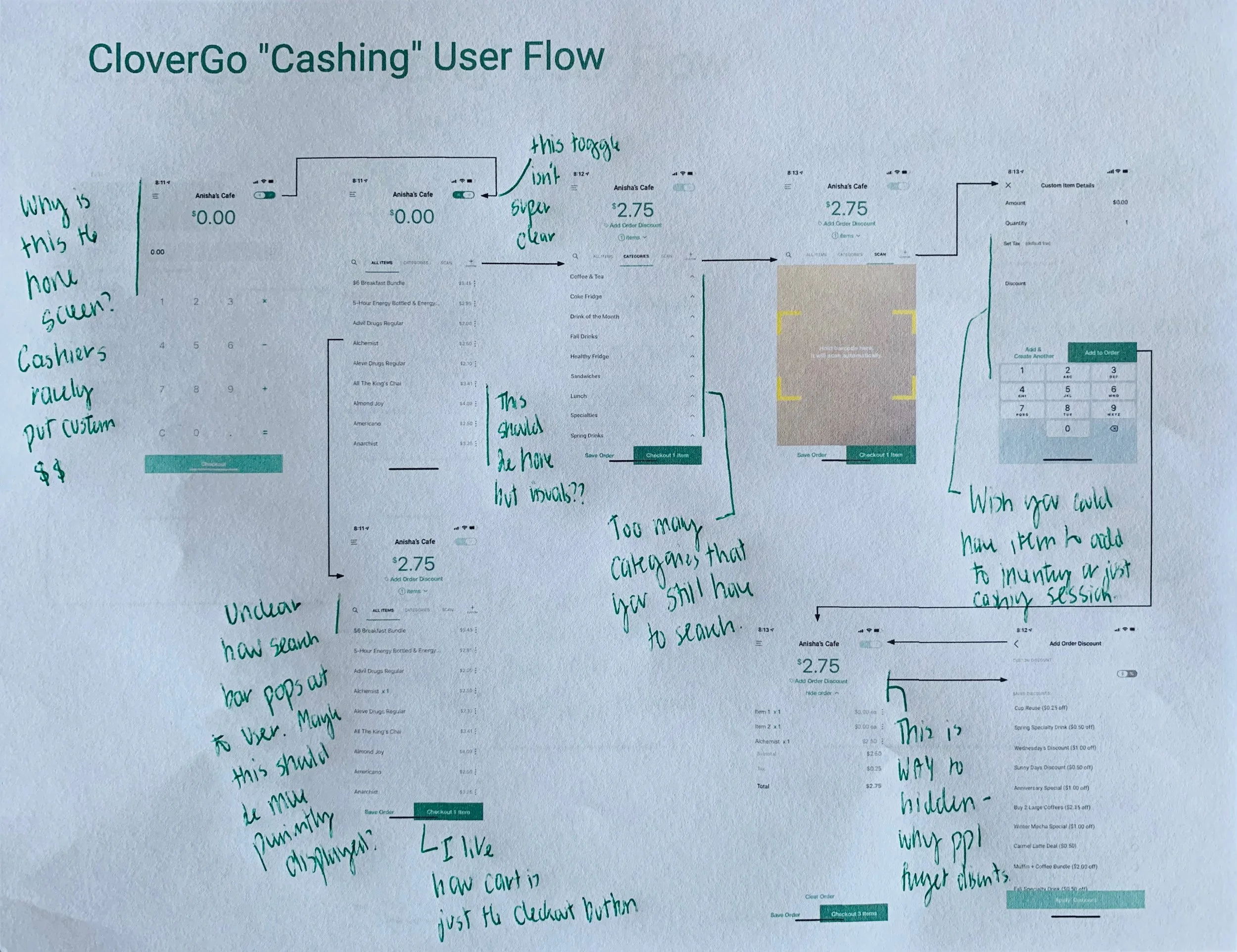
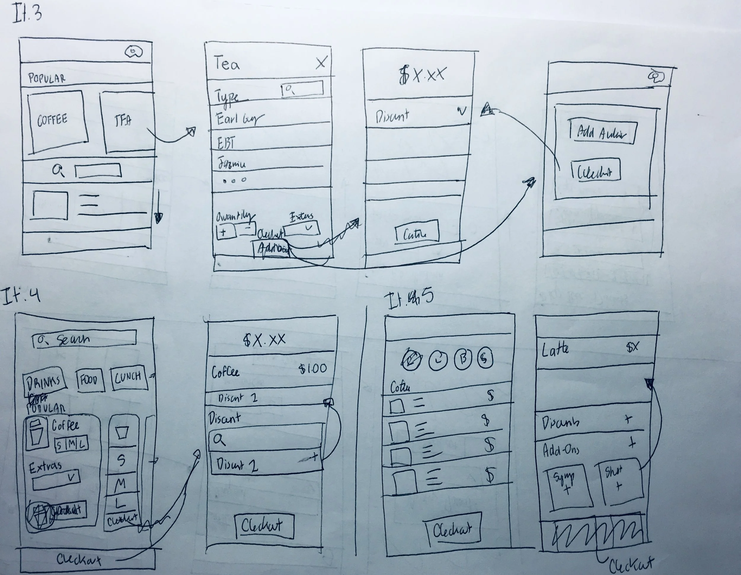
My user research revealed that one of the key challenges to Clover cashiers (on Clover Station) is the inability to find items. This is partially due to the lack of visual imagery that could help cashiers memorize the location of items on the central grid (as it had done in square). Overall, the time it takes to search leads to inefficiency and cashiers being distracted while a customer orders. While shifting from a search-based transaction screen is incredibly difficult for mobile, I found inspiration in a collapsed carousel view that would allow users to more quickly navigate to an item than in a traditional carousel. While a grid could allow users to see all of the products in a visual format, I elected the carousel view because I was interested in featuring only popular products for each product category. Moreover, I still wanted to maintain users’ ability to utilize the search bar and interact with a more minimalist list view.
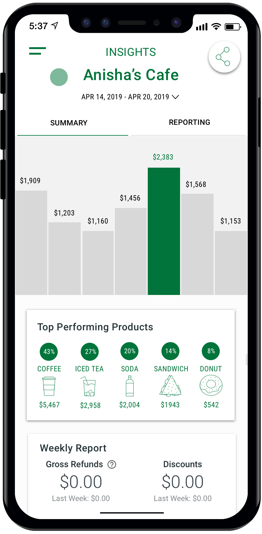
Analyzing Sales Data.
Increasing accessibility to Clover’s business insights by consolidating analytical reporting into one easy to use feature.
Clover currently offers its analytical capabilities through disparate mobile apps, as well as dashboard functions. Because of this, Clover is incredibly difficult for users to navigate and find transaction data that can be turned into actionable insights. To combat this, I combined the Clover Go Transactions and Dashboard pages with the Reporting, Orders, Payments and Insights features in the Clover Dashboard app. In doing so, I consolidated the disparate summary and query tools into two tabs. The first tab allows users to get high-level information about their storefronts’ overall performance. In the second tab, users can query for specific products, orders, payment forms and other factors by leveraging Clover’s sophisticated filtering system.
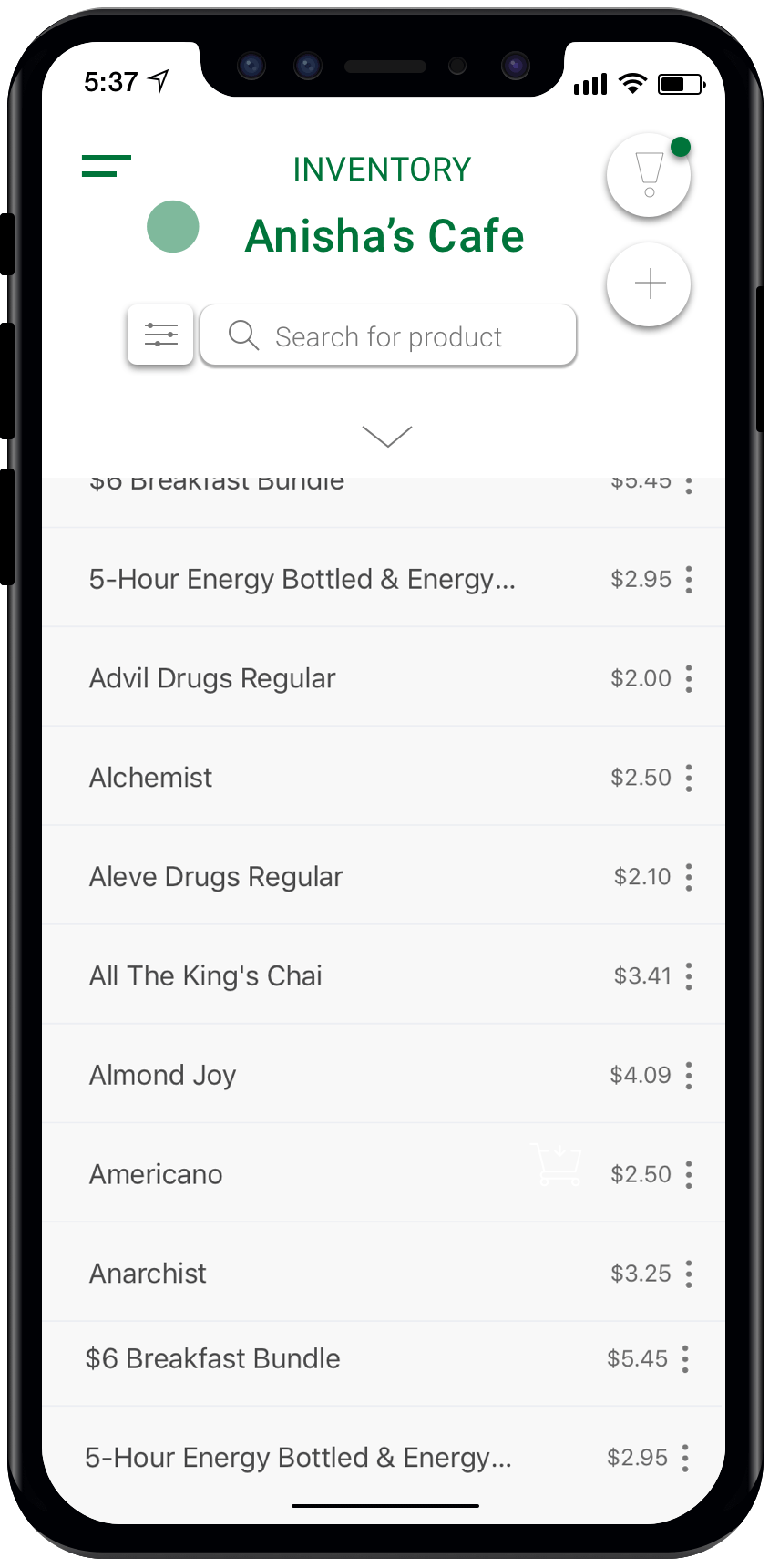
Managing Inventory.
Improving users’ ability to add, edit and delete items to prevent outdated inventories.
Clover’s current experience for Inventory Management (both on mobile and web) can be improved by using partial matching technology to discourage duplicate additions. In this frame, I reimagined the experience of adding an item as Clover Go searches for partial matches to other products. In doing so, the platform can save a manager’s time by preventing the need to unnecessarily add pre-existing items.
MEASURING SUCCESS
In efforts to assess and improve upon my prototypes, I would hope to test a few metrics that would reflect the efficacy of my designs. Because my principal objective was to boost operational efficiency, these metrics seek to determine the impact of my redesigns in that context.
Methods
I would facilitate a control/treated context or A/B test where user engagement changes can be uniquely observed for clients exposed to this version compared to those with the current product. I would use both quantitative data on platform usage and qualitative feedback through user interviews.
Overall Metrics
1. Client Change in Revenue. While this could be attributed to a variety of factors, change in revenue could reflect an improvement in business operations as a result of the redesign. This is especially true if assessed in a control/treated context where a change in revenue is uniquely observed for clients exposed to this version versus the current product.
2. Decrease in Mobile Drop-off. If the designs made meaningful improvements to the UX, users should be less likely to drop off.
3. Increase in Clover Go Mobile App Downloads. I would want to examine the effect of consolidating the Clover Go and Dashboard apps on user acquisition.
4. Overall User Feedback on the App. In my user research, I uncovered relative negative perceptions of Clover’s UX with severe apprehension towards the mobile experience specifically. I would want to see whether these perceptions changed from the new designs through user interviews.
Transactions
1. Decrease in Average Time Spent Before Checkout. Assuming that Clover tracks user’s sessions and navigation on the platform, I would want to see the change in average time elapsed between the start and end of the sale.
2. Decrease in Average Customer Wait Time. While quantitative in nature, this likely could only be assessed through qualitative user interviews with cashiers.
Analytics
1. Increase in percentage of Daily Active Users using mobile analytics features. Given the specifically difficult UX of the analytics features on mobile, with some functions such as insights not designed responsively, I would assess whether the redesign demonstrates improved ability to track sales data for Clover Go users.
2. Increase in users upgrading to Clover Insights. While I didn’t specifically touch on how the new analytics design would function with the currently paid tier with Clover Insights, I would want to measure whether the analytics feature redesign has an effect on upgrade demand.
Inventory
1. Decrease in average number of items not sold within the past year in customer inventories. With improved inventory management, I would hope to see less outdated products.
2. Decrease in average number of duplicate items in inventory. Because the redesign includes the new feature that prompts users to review potential duplicates, I would want to measure whether users actually add less duplicates due to the redesign.
3. Decrease in average number of items in inventory overall. With improved coordination in deleting outdated items, adding fewer duplicates and prompting users to established modifier products as modifiers rather than new items, there should be an average decrease in inventory.