
Caila
An early-stage startup aggregating the world's learning (videos, podcasts, books and courses) onto one platform and using artificial intelligence to create personalized learning tracks for its users.
Design Challenge: How can I design a mobile experience that empowers users to discover and consume online learning content curated by Caila?
Roles: Product Designer & UX Researcher
Tools: Sketch, InVision, Adobe Illustrator & Adobe After Effects
Duration: 2.5 Months
01 overview
FINAL DESIGNS OVERVIEW
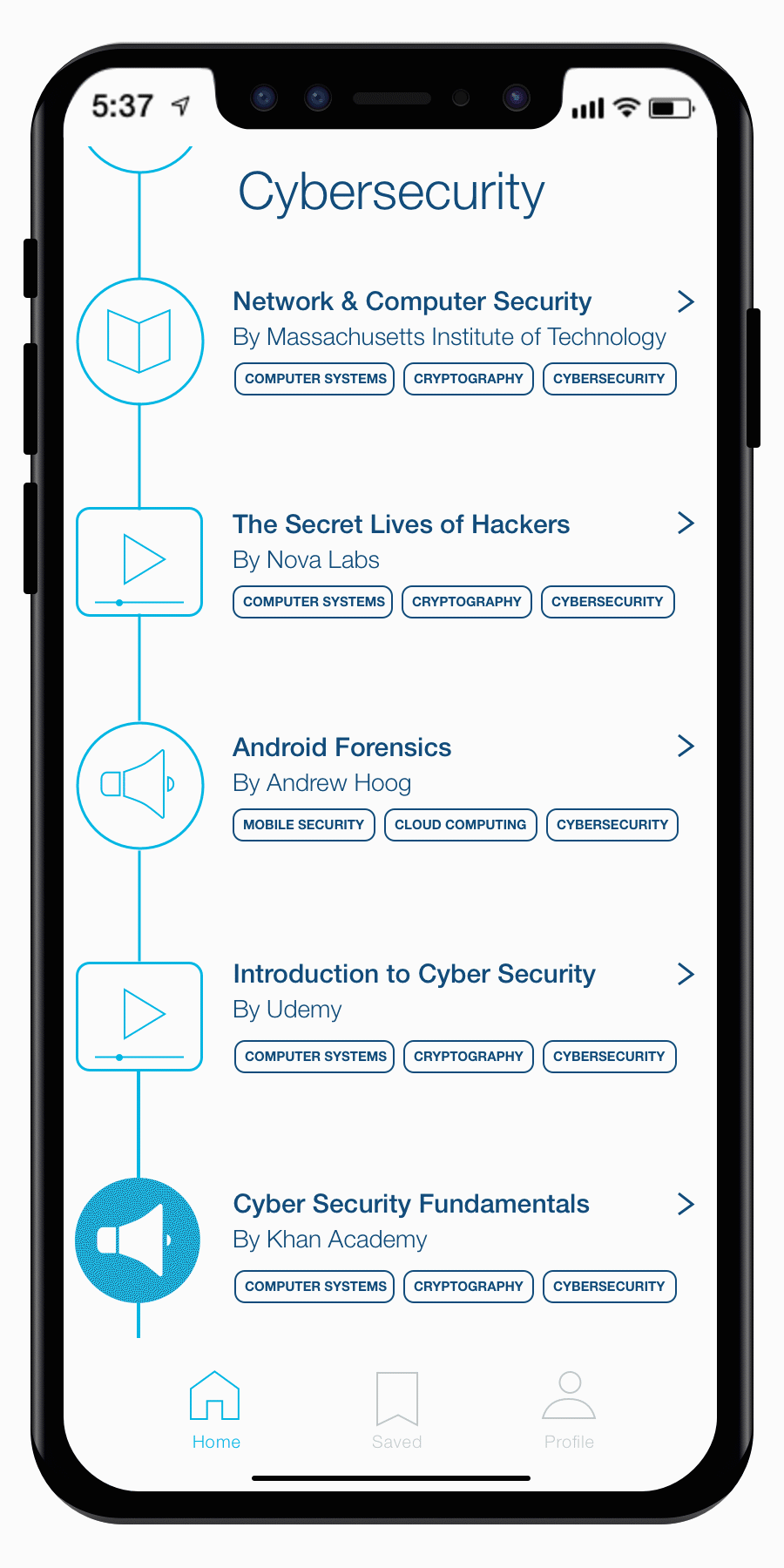
As defined by my designs and product specification, Caila allows users to track their progress through learning playlists (called tracks), explore learning content and connect with other users and professional heroes. Click through my final designs below to learn more about the product.


02 ideation
INITIAL MOCKUPS
My initial mockups for the Caila mobile app primarily centered the user experience around the explore functionality. After user feedback and market research indicating that the exploration of learning experiences is best suited for the web application, we pivoted the mobile design efforts to focus on other important goals identified above.


Iteration 1. Flight-Inspired Design
My initial mockups with its focus on exploration, sought to visualize the user experience of new users. I decided to follow the model of many e-commerce applications which allow the user to interact with the app before demanding a user action item (usually in the form of signing up). Especially for Caila, this seemed to be particularly key because the sign up experience requires multiple questions to help the AI technology optimize for user personalization. Thus, we wanted to demonstrate the unique value that Caila provides to the user before asking for information.
In this case, I was inspired by applications for flight search engines because I thought it cleverly conveyed the main purpose of Caila: to serve as a vehicle for users to get to their next career. Moreover, flight search engines are able to output useful data after asking only three questions: "from?," "to?" and "when?". Thus, in the first three slides, I sought to replicate this model with a rotating landing page that requires the user to solely type in one of the fields (searching for either future jobs or skills of interest) and press the search icon.


Iteration 2. Flight-Inspired Design Revised
After market research and feedback from the team, I implemented several key changes and built upon the previous design in my exploration of an active user's experience. A few of the changes demonstrated below include:
Changing the shade of blue after market research indicating that many educational and professional network platforms use a darker shade (including LinkedIn, which after acquiring Lynda, serves as our primary current user solution to the pain-point we seek to address).
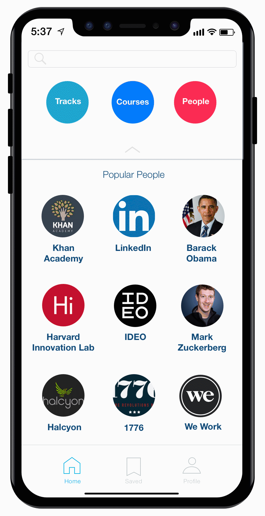
Demonstrating the more sophisticated search engine for a logged-in user with several key filters to optimize for user customization.
Emphasizing the connection between Caila tracks and tangible professional development. With the designated explore page offering tracks as ways to "become" a specific professional, we sought to make the benefits of online learning experiences feel as real as benefits of conventional degree certification.
Utilizing the home page to promote our AI algorithm's curated courses for each learner.
“Despite my progress in the ideation phase, I had a hunch that users prefer web-based exploration over mobile-based exploration. I decided to conduct user research to investigate this. This lead to my redefinition of project goals.”
03 inspiration
USER RESEARCH
Through ~20 informal interviews with users of diverse educational backgrounds focused on the drawbacks of current educational platforms, I uncovered the following insights that shaped my final prototype include:
A shift in focus from exploration to content consumption on the phone app. After feedback from potential consumers about their hesitation in conducting intensive searches on their phones, we decided to shift away from the exploration focus. While explore functions work well for most e-commerce and search-based applications, educational content often requires substantial research prior to user buy-in.
An introduction of widely-used educational gamification strategies into the app by focusing on user progress and an upward linear motion from the user's starting point to their learning goal. My research into the user-experience of fitness applications helped me implement this. This research into gamification in education resulted in the homepage display of a learning track similar to a playlist, to both optimize for immediate content consumption on the app and demonstration of progress. Similarly, this research inspired the personal analytics feature in each user profile.
An integration of social media inspired features to help guide users to possible learning tracks. As mentioned in my breakdown of project goals, user feedback indicating uncertainty about desired skill-sets demonstrated a need to help users find how they should upskill. While matching skills to professions is a key way Caila seeks to address this problem, the ability to see the tracks of global leaders is a means to engage users who may not be informed about specific career paths.
REVISED GOALS
Because the Caila team was in early stages of product development, I surprisingly had a large amount of autonomy over the goals of the product.
Using my user-research findings , I convinced Caila’s CEO and CPO to expand their exploration-focused app to include tracking and connecting functionalities.

Explore.
Providing users the ability to explore courses by having a clean interface for user to find courses, tracks and peers
The central purpose of Caila as defined by the initial product specifications is to allow users to find courses that are already available to them with ease. While originally the central purpose of the mobile experience was to promote exploration, after researching other educational applications, it seemed this exploratory function was most used on web and desktop platforms. This is especially true because finding educational courses requires planning (especially for the in-person courses that Caila includes in its database). The mobile experiences of educational applications are more geared towards content consumption.
Track.
Providing users the ability to track their progress to gamifying the process of online learning
User retention is a challenge for many learning applications and gamification is a method to combat high drop-off. One strategy rests on breaking down material visually into small targets. While many platforms already use reward systems, individual steps often require hours of effort (ex. getting a badge after an entire video course series). We want people to see themselves progressing every time they open our app. Moreover, by intermixing learning experiences that are often overlooked by online course providers (ex. podcasts, shorter articles and short Youtube videos) with more typical courses, Caila can provide a more holistic learning platform that better executes gamification strategies. Thus, my design integrates features to maximize learning outcomes from pre-existing content.

Connect.
Providing users the ability to connect with their professional heroes and peers to help guide their learning experiences
Caila’s theory of change rests on users knowing which skills they hope to acquire. However, we found that many people are unsure of their next professional direction. We decided to build upon our gamification strategy to help individuals both strive to continue their educational pursuits, while providing direction to users who may be unsure of their next career move. This resulted in an expansion of the explore functionality to view courses and tracks created and pursued by other users. By seeing what coworkers are learning, we hope to increase dialogue and friendly competition to further gamify the app. Moreover, we decided to take this one step further to answer the question, "how do I become the next __." In our initial product development, we created learning tracks that we believe reflect the unique skill-sets of professional heroes. However, I envision Caila one day serving as a platform for leaders to both further their pursuit of learning and create tracks for their fans.
04 ideation pt. 2
MOCKUPS FOR REVISED GOALS
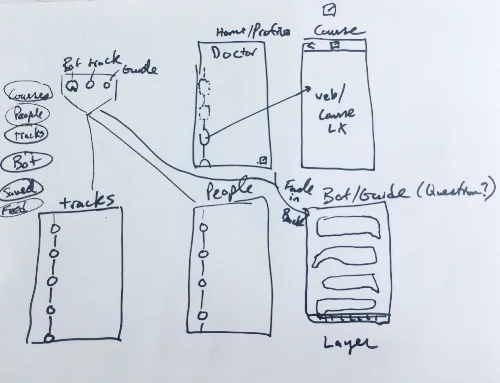
Iteration 3. Chatbot-Enabled Exploration Design
Using the three insights learned from more extensive user research, I was able to dramatically shift away from the exploration-focused user experience to one that more closely resembles my final prototype.
However, during these deliberations our engineers developed a chatbot functionality. Given our new focus shifting away from exploration, we decided to use an in-app chatbot as the sole exploration feature.


05 prototyping
USER TESTING
The third iteration of the user flow was extensively refined by informal user testing. Our team had been testing our assumptions primarily through user interviews with other Halcyon Incubator fellows and HR representatives inquiring about our product (our initial product launch wanted to focus on professional development within companies to generate revenue). However, when Caila was invited to Ebay's Inclusive Innovation Hackathon, Caila's CEO, COO and I decided to devote our weekend to getting user interviews focused on informal A/B tests to help guide my user interaction design decisions. Below are a few of the tests we conducted.
Navigation Flow Informal A/B Test


After conducting A/B tests with the icon and hamburger pop-up menu's (displayed in the third image), we found that users were more likely to press the hamburger menu because they were unaware that the icon button represented the menu. However, after user interviews comparing the hamburger pop-up menu and the navigation bar, the navigation bar appeared to facilitate the easiest user flow.
Saved Courses Flow Informal A/B Test
Saved Courses User Flow 1.

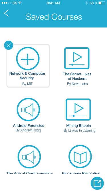

Saved Courses User Flow 2.


Both A/B tests and user interviews demonstrated increased difficulty in holding down and dragging saved courses into tracks in the first user flow. Thus, the second flow easily emerged as the most favorable iteration of the saved courses experience.
Analytics on the Home Screen Informal A/B Test


A/B tests between the first two screens indicated that users would often try to click on the "15 courses completed" analytic, thinking that it was a button. When asked to compare the two in user interviews following the tests, users often opted for the first interface, citing it to be much simpler. Moreover, in these user interviews, we also would informally present the later screen as a possible way to both focus on analytics and shift Caila's image. Based on their feedback, we concluded that while more visually stimulating, the third mockup fails to represent the professional branding of Caila and promote immediate content consumption.
User Feedback on CailaBot
In this user flow, we decided to eliminate the explore functionality and replace it with the CailaBot, which we currently use to deliver our product. This would have been implemented with an in-app messenger in which the user could communicate with CailaBot. The chat bot is able to recommended individual courses to the user which they can choose to add to a learning track. However, after user interviews demonstrated the importance of being able to parse through multiple options for learning experiences, we decided to re-integrate an explore function into the app.
INVISION PROTOTYPE (IPHONE 6)
After the process of user research and testing, I refined the user experience to touch on the three aforementioned goals: explore, track and connect. Below is an app demo that details the final user-experience. After I designed the mockups in sketch, I created a prototype in InVision to record this video.